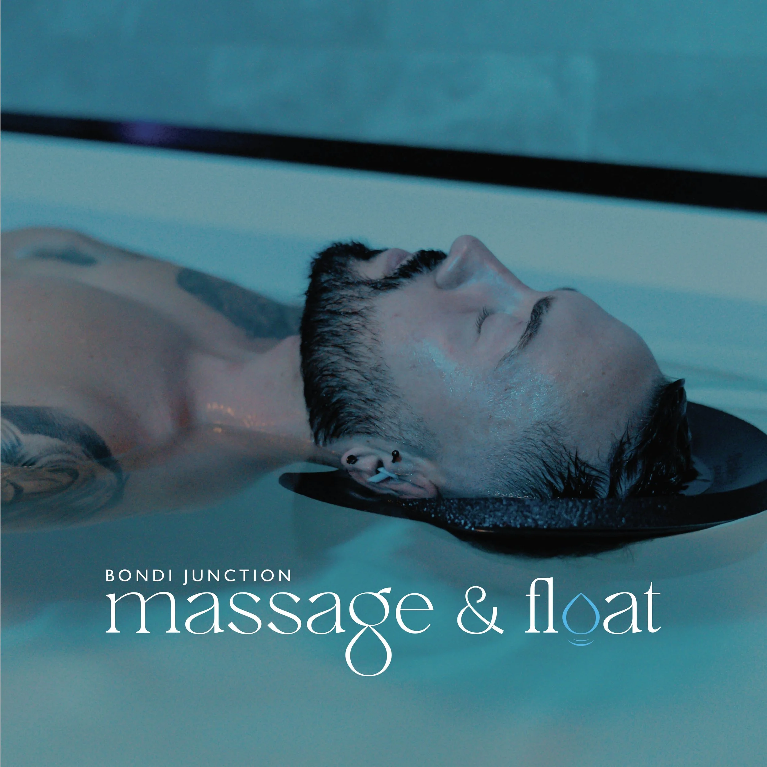
Massage & Float.
Massage & Float is a health and wellness centre in Sydney, offering a range of recovery treatments for physical and mental health.
Their brand values are focused on their clients and giving them a comfortable and positive experience to rest, relax and revitalise. With services ranging from float tank therapy and massage, to facials and reiki, postural correction and more, it was important to make a brandmark that draws the calmness of the centre’s atmosphere.
The icon represents a water droplet and ties into the serif wordmark by being part of ‘G’ and ‘O’.
The main colour palette of black, white and blue, represents open spaces, freedom, intuition and inspiration, which reflects their centre to its core. It was important to have a logo suite to use across different assets.