
Wise Monkey.
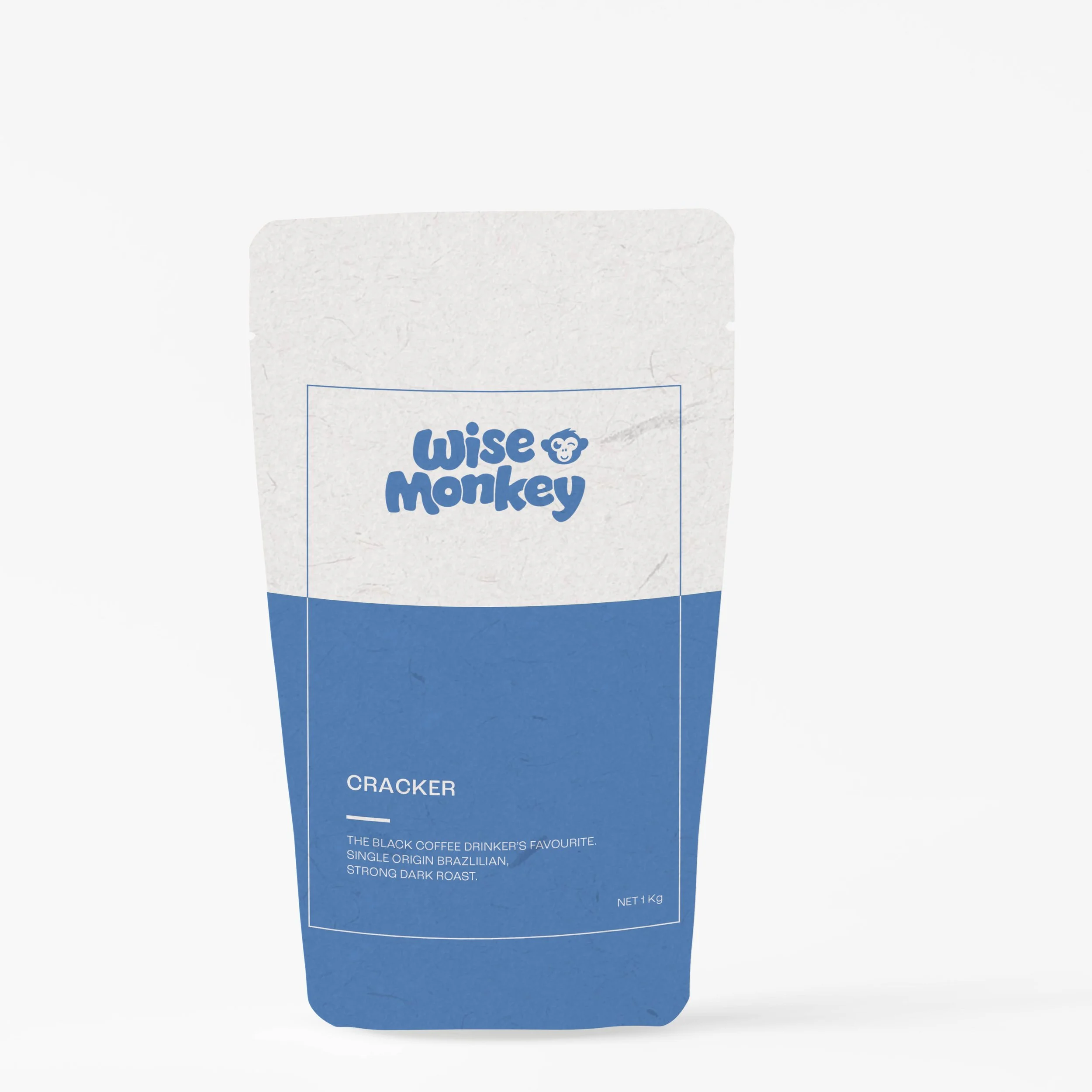
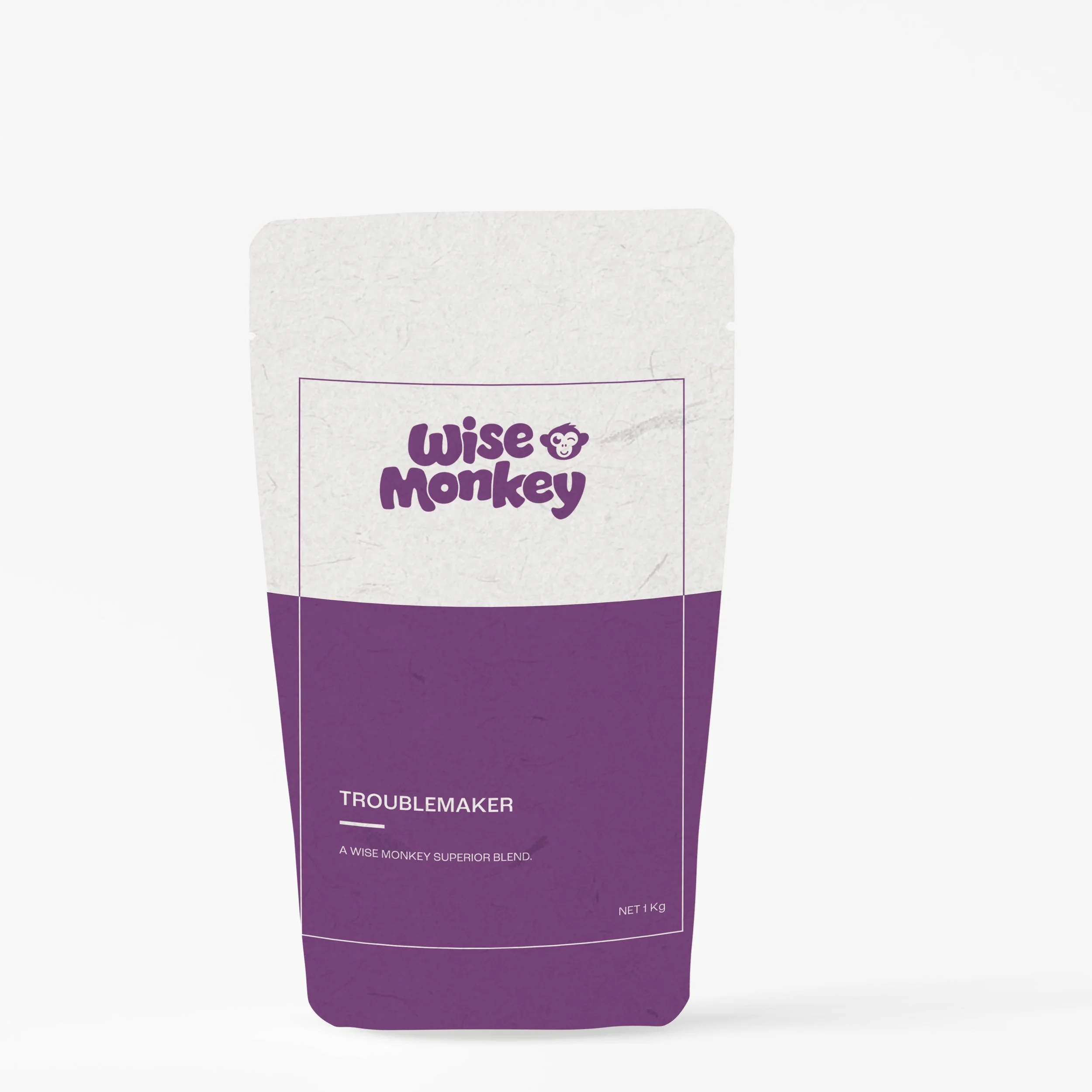
Wise Monkey is a local coffee roaster in Townsville. The rebrand direction was based on the character and name sake, a monkey, with its main features becoming the main icon for the brand - cheeky, quirky and fun.
Having an icon that is interchangeable allows for more of the brand story to come out, that represents each of the coffee flavours with their unique tones and individual origins.
The wordmark fits with each of the icons, as it’s fun and a little quirky, but remains modern with a sans serif typeface. The colour palette is bright and bold, to make the packaging stand out while on the shelf.